Top
J.
J.
Designed by
 
Art Vagabond case study

Connecting the Art Market

This project pushes me to create an end-to-end application. As a former art world professional, enthusiast and business student, I wanted to create an application that would support artists in their day-to-day operations.

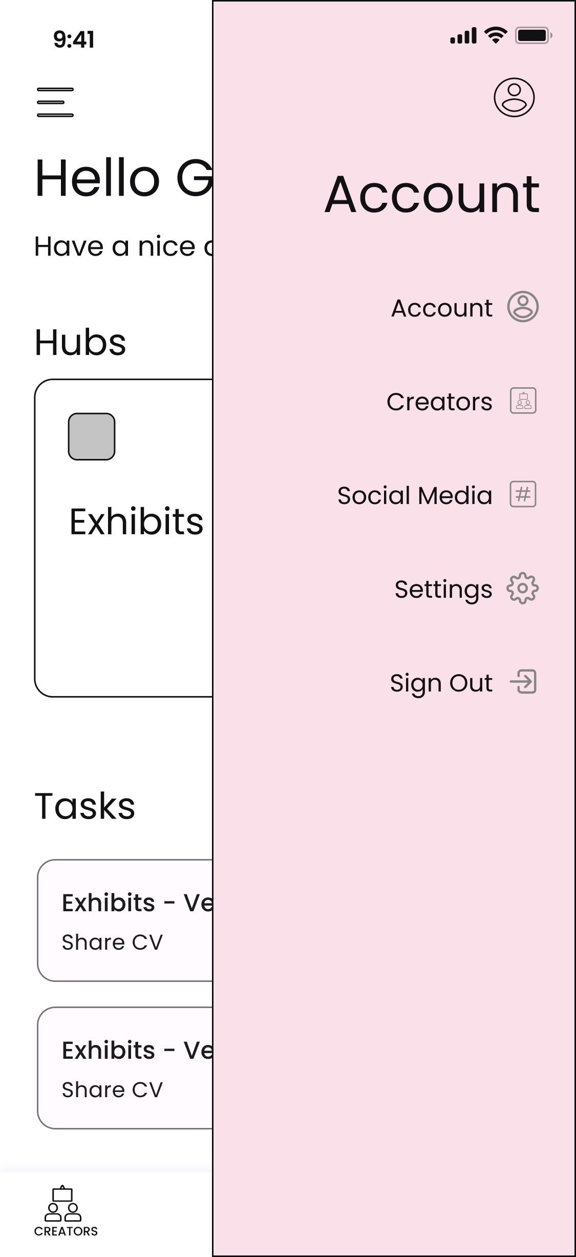
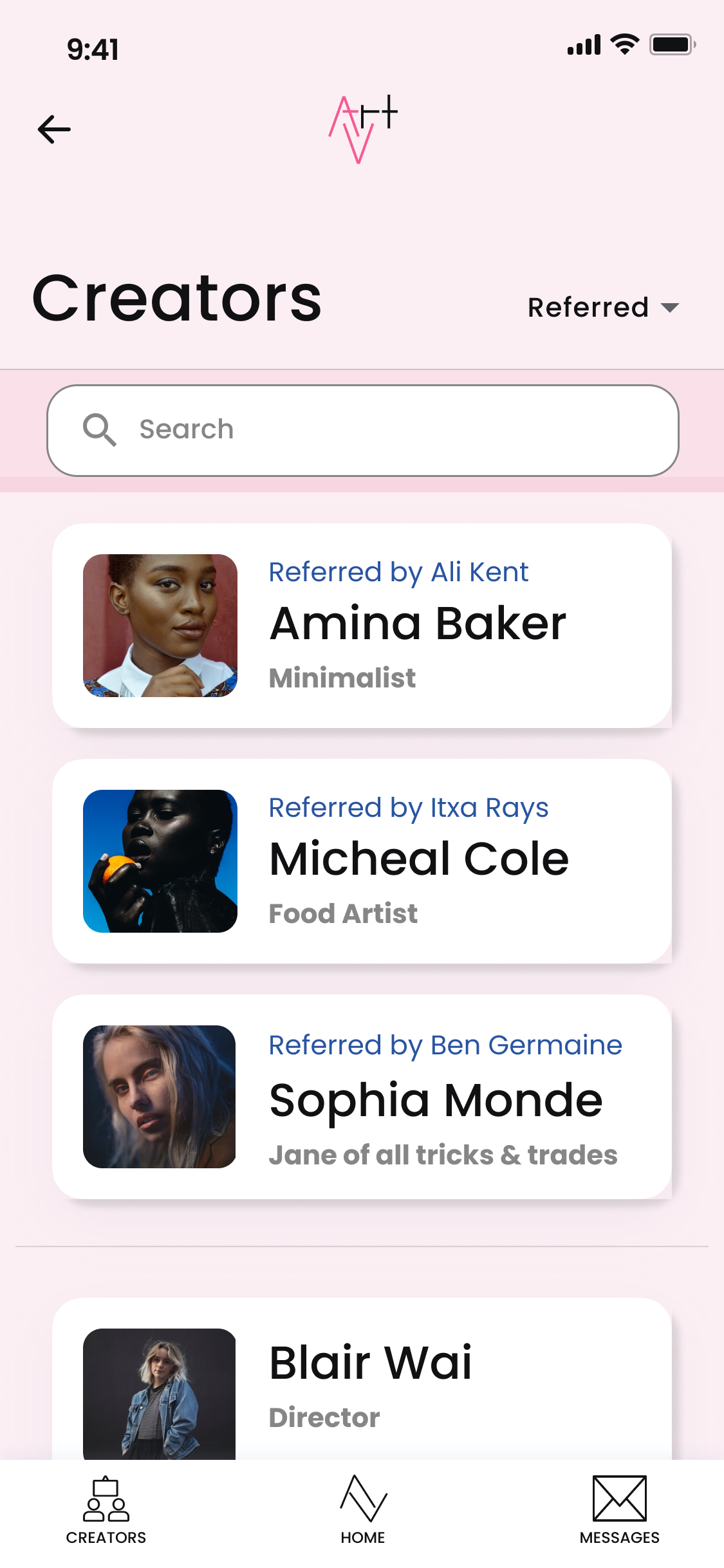
Art Vagabond wants to make the work behind that artist’s exhibition seamless and easier to manage through the ups and downs of their schedule.

 Role:

UX/UI Designer

Time:

4 weeks, 120+ hours


Empathize


Understanding the User

I conducted research on the art market by looking at direct and indirect competitors. Given that this application would be a new product in the market, I looked at competitors as companies that would also be able to easily create a similar product.

To strengthen the data, I created a survey to gather feedback from art world professionals. The survey would help to understand if there was a need for a task manager application.

 
Competitive audit

Competitive Analysis and Provisional Personas


User Interviews

Users and Audience

The goal was to My research questions were multiple-choice and open-ended. These questions are designed to prompt honest responses that would lead to qualitative findings as to what helps users when they want to organize their exhibits / projects and collaborate with their partners to do it efficiently while they are on the go.


Objectives:

We want to know what current creatives consider, their objectives, motivations and concerns when collaborating with institutions.

  • Understand the user(s) and job(s) to be done to identify potential tasks that are higher priority.

  • Define the online experience for users using the application. 

  • Identify how an artist and institution (like a gallery) collaborate with each other for projects.

Participants:
Artist - 40%
Gallerist - 40%
Museum personnel - 20%

Overall, I was able to recruit users within the art world to gather their responses in collaboration with the previous survey responses.

I cleaned up a lot of the data from the prior results so that it would be relevant to the survey.


Insights

Participants provided feedback about the pain points they experience when planning art events and suggested features to make their planning efficient.

Pain points:

  1. Scheduling and communication conflicts

  2. Unpredictability and unexpected changes with no notice/heads up

  3. Collecting materials in a timely fashion - images, artist statements, etc

  4. Schedules lining up -- competing priorities

Priority features:

  1. Organizer / coordinator

  2. Input shipping details for artwork & ability to export info for chose shipper

  3. Application for artist applying to a gallery -- focus on resume, hi-res images, and artist statement

  4. Work queue that allows artist to upload images, add them to queue, and collaborator can provide real time feedback by "check" or "x" the work

Maze responses for application need

Takeaways

The responses for whether the app is needed, is neither a significant yes or no. However, the average was about 50/50. Since the users couldn’t name productivity products that focused on planning exhibitions. There’s still a chance that such a product can be impactful for artists and their creative collaborators.

In this image, you'll notice that the responses for the need of this app are between 1 - 10.

define


Determining Options

The lack of a direct competitor or similar application on the market seemed like an ideal. I wanted to connect this opportunity with the need that would be presented in the market by creating a goal statement, problem statement and a persona of an artist. Illustrating these statements and persona would allow stakeholders to connect to the potential gap this application would fill if brought to market.

Goal statement

Goal Statement


Problem Statement

Persona

After creating the goal and problem statement, I thought about the things that came up in the surveys as pain points and insights. I used this to put together Gustavo’s persona.

As an emerging artist, his needs focus on collaborating with his current gallery while also balancing making art and traveling to awards/biennials. Given his busy schedule, his competing priorities make it a necessity to plan logistics on the go.

Artist persona

Ideate


Brainstorming Solutions

Gustavo’s busy schedule and competing priorities represents the needs of other artists and art world professionals.

To brainstorm possible solutions that would provide a solution and a foundation for this application, I led a card sorting activity that would identify the organization of the application. The result helped to inform the site map and the layout for the user flow.


Card Sorting

Objectives:
To identify sections and categories that reflect a natural order or pairing for users.

Participants:
There were 7 participants from a variety of ages and gender.

Card sorting activity results

Card sorting activity results

The results show that many of the categories had overwhelming responses, which would make it easier to group. However, the participants for this card sorting activity were UX/UI students and as a result, does not have the perspective of art world personnel. Given this insight, its results signal that several sections will need to be listed under different categories for users.

I will be providing access to multiple sections in more than one category, such as Menu and Account for Packaging. Although this is just to help sort the categories, it provides some guidance in what combinations may make more intuitive sense to users.


Site map

This sitemap is a result of organizing that information and cross referencing the sections users felt were either related or present in multiple location.

Many sections are listed in more than one location for ease of access and navigation for the user.

Site map

 
User flow

User Flow

User Flow

I was focused on what are the actual paths the user will likely take, and potential ways for them to go into these paths. This exercise feels more in line with planning out the Information Architecture based on what was shared during Card Sorting.

I updated the flow to include questions the user will ask themselves as they progress through the app so that there are pauses for an end point.


Next Steps:

The card sorting activity, site map and user flow allowed me to consider what pages needed to be created for the wireframes. The user flow, in combination with the wireframes, would be the foundation for the prototype.

Prototype


Simulating User Experience

Wireframes & Mockups

I created wireframes that elaborated on the paper sketches and with each version, improved upon the original design.

Version 1: Laid out the different sections that were originally named Priority, Main and Gallery. The idea of a Menu, Account and bottom navigation were always part of the concept.

Version 2: Added icons and images to the wireframe to help test the possible categories and layout of the application main screen.

Version 3: Defined and simplified sections by adding new labels, removing icons, including color and consistency.

Version 4: Included a greeting, updated cards, labels and updated content layout.

 
Mid-fidelity design

Mid-fidelity design

Wireframe iterations

Wireframe iterations


The mid-fidelity designs enabled me to bring certain aspects to life by adding color and dimension to sections.

From login, you'll be on the main page, which will show you your hubs (exhibits, calendar, etc.) and tasks. You can then head on to different hubs like calendar, a close-up of your calendar, add tasks/events. Afterwards, you can then go to another hub, such as exhibits or portfolio. These can also be accessed from menu.

From account, you can access other sections, like creators, profiles and sections of the creator profiles. Finally, you can access your account, and other specs related areas from there.


Prototype

I updated the tasks to mimic the user flow participants will test when using the application. It includes an awareness that the user will continue from the task to read and respond to a message, onto the next two tasks. The following task would be to send the document required to his gallery contact. The last task was to locate and message an artist that was referred to the user. The outcome of this usability test would convey any gaps or opportunities within the application that would lead to revisions.

Prototype of application

test


Validating with Users

To test the effectiveness of the user flow and app design experience, I conducted usability test that was both moderated and unmoderated where users were asked to complete tasks in the application.

Usability Test


Test Objectives

  1. Identify and improve the UX/UI of Art Vagabond’s app experience through the following steps:

    1. Find the tasks needed to complete in application.

    2. Message collaborators and creators.

    3. Locate creators and referred contacts.

    4. Test overall usability of the application.

    5. Identify pain points and potential opportunities.

Test Details

  1. Remote, unmoderated: I will have the participants complete tasks using Maze.

  2. Remote, moderated: I will have the participants complete tasks using Figma and Google Hangouts.

  3. Participants will attempt to complete a set of tasks from the prescribed list of actions based on the flow for this prototype.

  4. Participants: 18 - 60 years of age, All genders, 5 testers

 
Affinity Map

Affinity Map

Affinity Map

The Affinity Map provides a synopsis of what users shared and the common themes that rose from the test. The result is a condensed view of successes, concerns, observations and suggestions organized by themes. The topics were narrowed down to interaction design, UI and content and uniqueness. See below.


Prioritization Matrix

The suggestions I prioritized were:

  • the UI task, which includes updating and aligning the Menu, Creators, and Tasks sections. It also meant that I would be adding descriptions to sections.

  • to shift the share button visible and prominent.

  • to rearrange the subsections in the Account and Menu tabs.

  • to include a search option on the Creators page.

Although the UI update requires more effort to accomplish, I still tackled these changes to the application because it would improve the overall user experience.

Prioritization Matrix

Prioritization Matrix


The Results

Before

After

The revised prototype focused on specific changes that improved the overall user’s experience. This included an overhaul of the applications user interface.

Home

  • Added notification bar to inform users of any updates

  • Included a description to make it easier for users to know what each section focused on

  • Coordinated icons and colors for easier identification

  • Prioritized Tasks to improve app focus


Menu

  • Moved core functions to Menu tab from the Account tab to improve the user flow

  • Adjusted icons to correlate with sections

  • Aligned text and icons to maintain a consistent look and experience


Messages

  • Differentiated new messages from older messages

  • Updated the date format based on application use base

  • Reorganized spacing for legibility


Documents - CV

  • Updated the Edit button to be a Share button, the shift would make the button visible and prominent

  • Changed the button color to be consistent with the overall UI


Creators

  • Changed the Filter button and location to improve overall look and use

  • Included a search option to easily find other creators


Outcomes

I worked on the fidelity of this prototype from fixing the top and bottom navigation to A/B testing different versions of the card’s color palette selection for a consistent theme. This included updating the copy for the main screen by having impromptu feedback sessions with friends about which word better fits (Hubs, Collections, Gallery, etc.). It has been such a long road to get the application to where it is but it’s exciting to see its progression from concept to reality.


Takeaways


Lessons Learned

This project was conceived during my Google Coursera certification. I decided to tackle it as an ongoing project. From concept to realization, the application design has been a transformative development. I learned that going through the design process again gave me the chance to consider opportunities and gaps that would improve the iterations of the application.

There were challenges with the survey design and recruitment process. However, the experience taught me how to consider data and still make the results beneficial by looking at how the results impact the application. Each step of the process was driven by how can the information gathered improve the application.