Top
J.
J.
Designed by
 

Mind the Gap Coffee

Mind the Gap Coffee is a New Jersey-based coffee shop and e-commerce business that was launching a website and brick and mortar store at the same time. They were focused on growing their local e-commerce business and expanding their social media reach through an engaging website experience.

For this freelance project, my focus as a UX researcher and designer was to create a website experience that would connect Mind the Gap Coffee with future customers in-store and online.

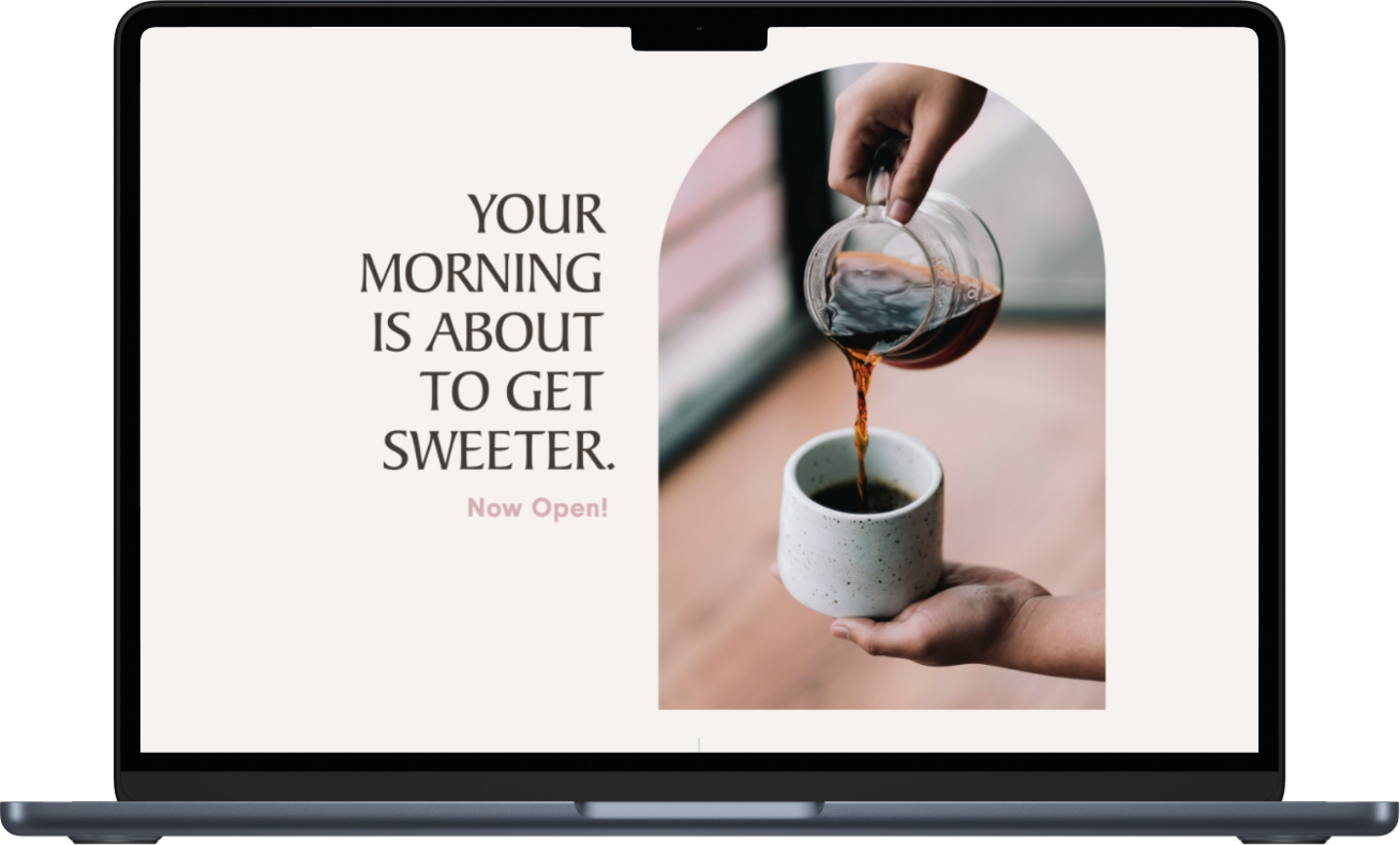
Artboard for Mind the Gap Coffee that shows the landing page.
 

Role:

Lead UX/UI Designer

Duration:

8 weeks, 100+ hours

Stakeholder:

Mind the Gap Coffee


We considered how we would launch a website to cross-promote a brick and mortar business.

unsplash-image-6VhPY27jdps.jpg


Role

To make this project a realization, I was the UX/UI Designer and I collaborated with Karen-Claire, another UX/UI Designer, to tackle the design process.

My deliverables:


Research

We sought to understand if the coffee & tea lovers interacted with the websites of coffee and tea shops and what they looked for in their website by using Maze to conduct a remote survey. The participants were international coffee and tea enthusiasts.


unsplash-image-7ffS5VydFBA.jpg


Findings

Participants want to know more about the business owners, company’s brand and products.


Research Recommendations


To create a website experience that incorporated the following:

  • Data

  • Cross-marketing

  • Connected platforms


unsplash-image-gy_DN08336U.jpg


Wireframes

Karen-Claire created wireframes that elaborated on the paper sketches.

The wireframe exploration allowed us to organize the content users wanted to see in different iterations. This included “our story” and “services” sections.

Landing page wireframe options.


Usability Testing

Prototype

The prototype allowed users to experience two design layouts per each page (Home, About, and Product). The end goal was to have users select one of the options for each page and provide feedback on the task of navigating through the site to learn about the owner, company and products.


Findings

  • Users preferred option B of our Home, Product and About pages.

    • Participants felt the Home page layout was cleaner, easier on the eyes, and had a better balance.

    • Participants liked that the Product page included larger images that would allow them to see the products in better detail.

    • Participants felt the About page was more succinct, straightforward, provided more white space and was easier on the eye.

  • Users shared that they wanted more content clarity, including descriptions, and images that told a better story about the overall business.


 The Outcome

Using Squarespace, I created three visual layouts for the owner’s website and presented them to her as options to switch through.

Implementing the visual design across platforms entailed reviewing each element to confirm brand continuity on laptop, and mobile devices.

 
Mockup that includes visuals of the website on two mobile devices and a laptop.
 
 
Image of landing page hero section.

Landing page


Image of Our Story, which is the about section for the website.

Our Story page

 
Image of Contact page, including information about online orders, email, hours of operations, location and contact form.

Contact page


Image of the shop page that includes a holding message while the e-commerce store is closed.

Shop page


 Accomplishments

  • Increased client leads by 100% percent

  • Managed client relationships to build trust in my recommendations

  • Collaborated remotely across time zones with another designer

unsplash-image-KixfBEdyp64.jpg


What I wished I had more time for?


Building out new content:

  • Users want to know how-to’s, from steeping tea and coffee to creating an at home latte. Consider blog posts and any cross-social media promotions.

  • Users seek features that allow them to easily navigate the website, search for products by type and moods.

Shopify website exploration and implementation.


Lessons Learned

From this experience, I learned the value of working within design and platform constraints. As a result, I created a visual design using Squarespace that met the client’s expectations.

In the future, I’d like to dig into UX engineering and collaborate with front-end developers in the design process.

Long scroll image of the Our Story page that shares background on the business.